Champions Zine: Editing and Sequencing
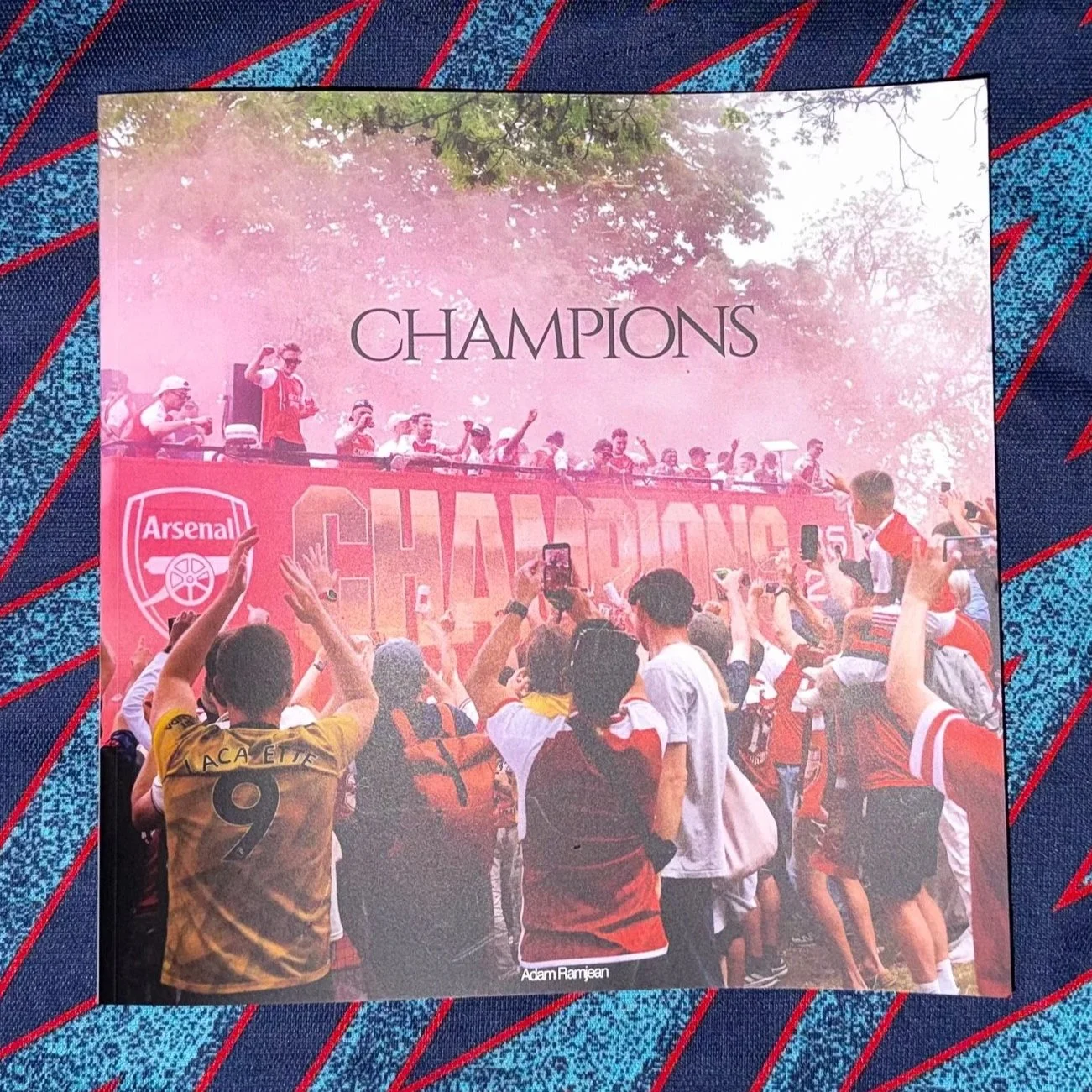
Champions, out now.
I’m doing a mini-series of blog posts about my new zine, which technically started two posts ago (I hadn’t really planned to do this then):
Editing and Sequencing: You’re here
Publishing and Printing: Stay tuned
Pricing and Selling: Stay tuned
So I guess welcome to episode 2: Editing and Sequencing.
Editing
First of all, editing. I knew the period I wanted to cover with this zine: from 19th to 31st May, from winning the title to the trophy parade. This period encompassed four events: the title victory (135 photos), the Champions League final (144 photos), the trophy lift vs. Crystal Palace (270 photos) and finally the parade (583 photos).
That is 1,132 photos! I wanted to get this down to somewhere in the region of 30–36 for a zine, so some major culling was needed.
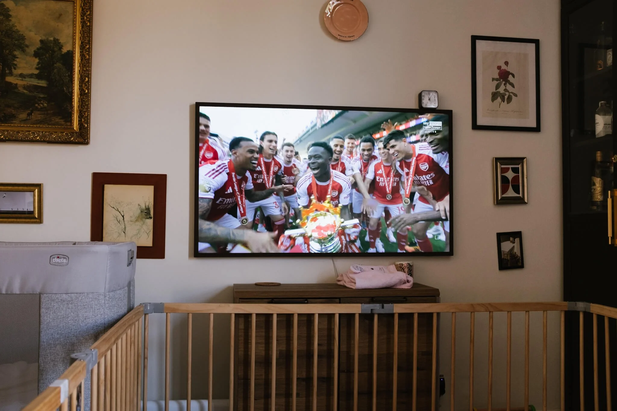
I had to watch the trophy lift from home after failing to secure a spot inside a pub. Straight back out afterward though!
The Champions League was cut. Most of the photos were inside a pub (shout out to The Gunners Pub!) and didn’t really fit in with the rest of the photos, which were outside. I also didn’t want this just to be a zine about the parade, so I made sure I took a mix of photos.
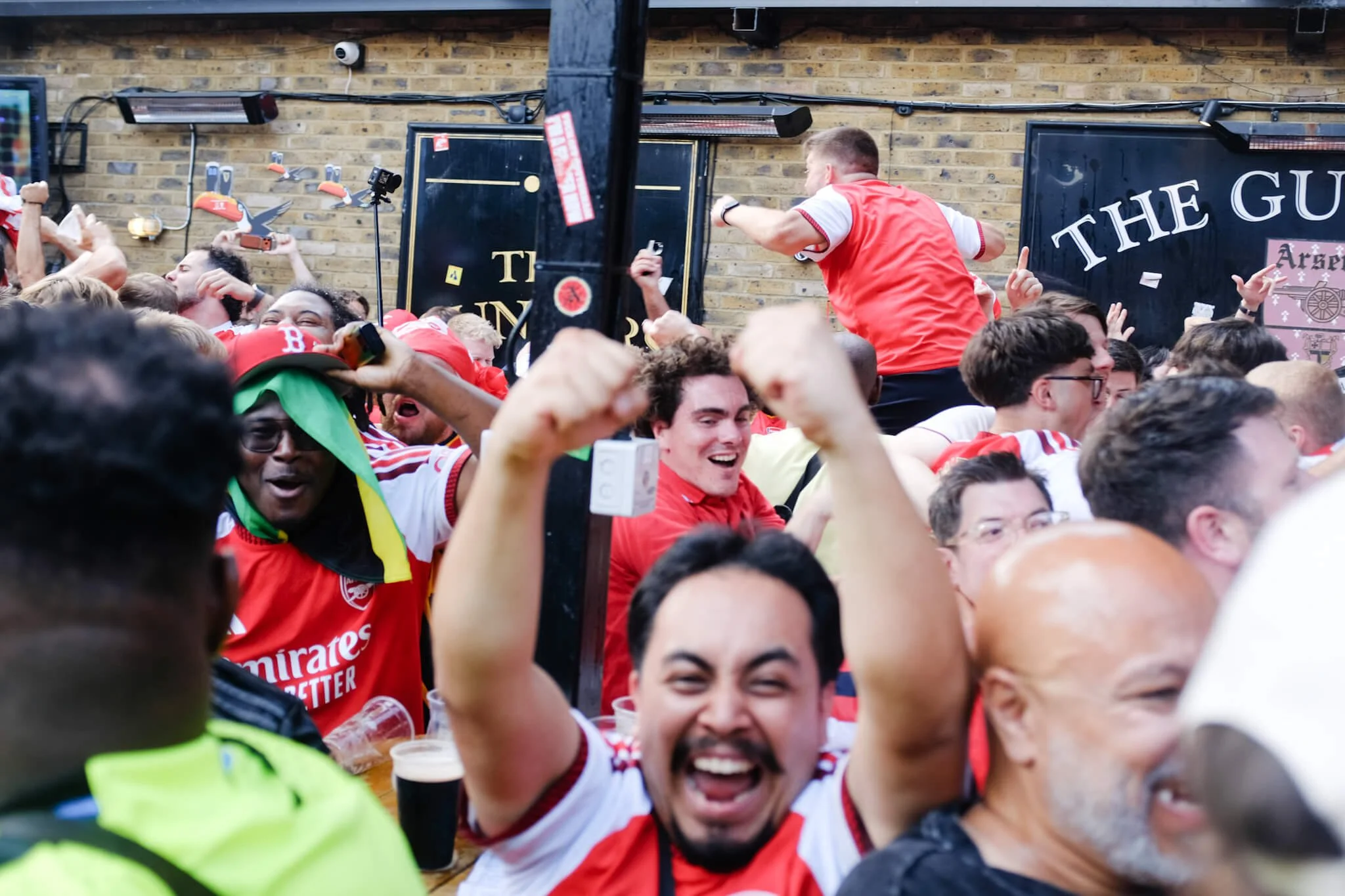
The Champions League final at The Gunners Pub. Cut.
After a few rounds of culling, I had around 80–90 and then moved on to sequencing. At that stage you naturally cull some more, as some images, even if you like them, might not fit a sequence. The image below is an example of this. I liked the image, but I already had two other images in a sequence that were similar, and to avoid things becoming too samey, I had to cut it. This image also works better with a 5:4 crop, which would have made it an outlier in the zine (the rest are 3:2), helping to confirm the decision.
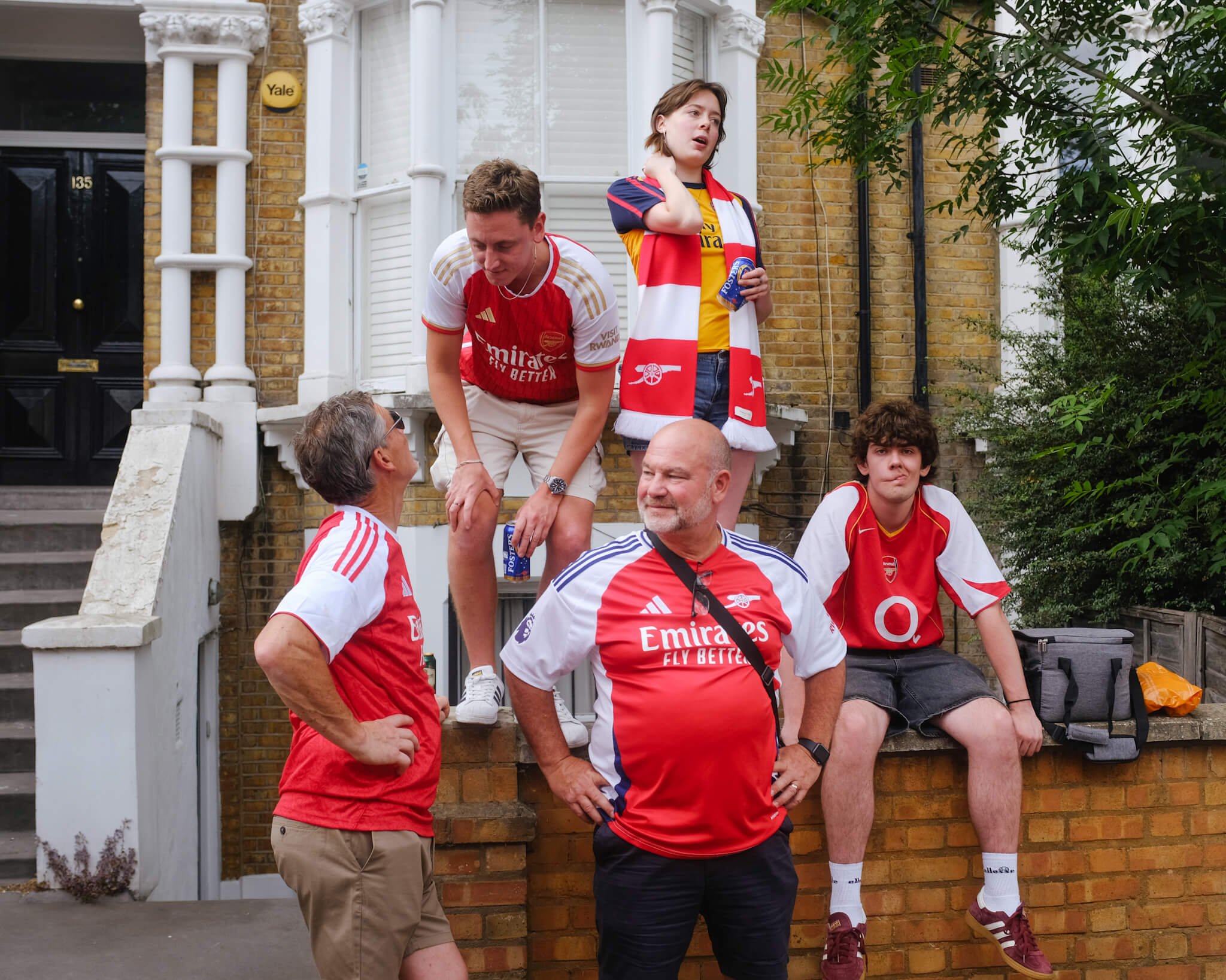
An image I liked, but had to cut
Sequencing
I can’t say this is the best way of doing things, but I personally like to consider the overall “storyline” of the zine. The book I previously made for my brother and me was strictly chronological, with a blank page separating each event. For the zine, I didn’t want this. I wanted the energy to build from a quiet start to more hectic daytime scenes, finishing with more chaotic night scenes.
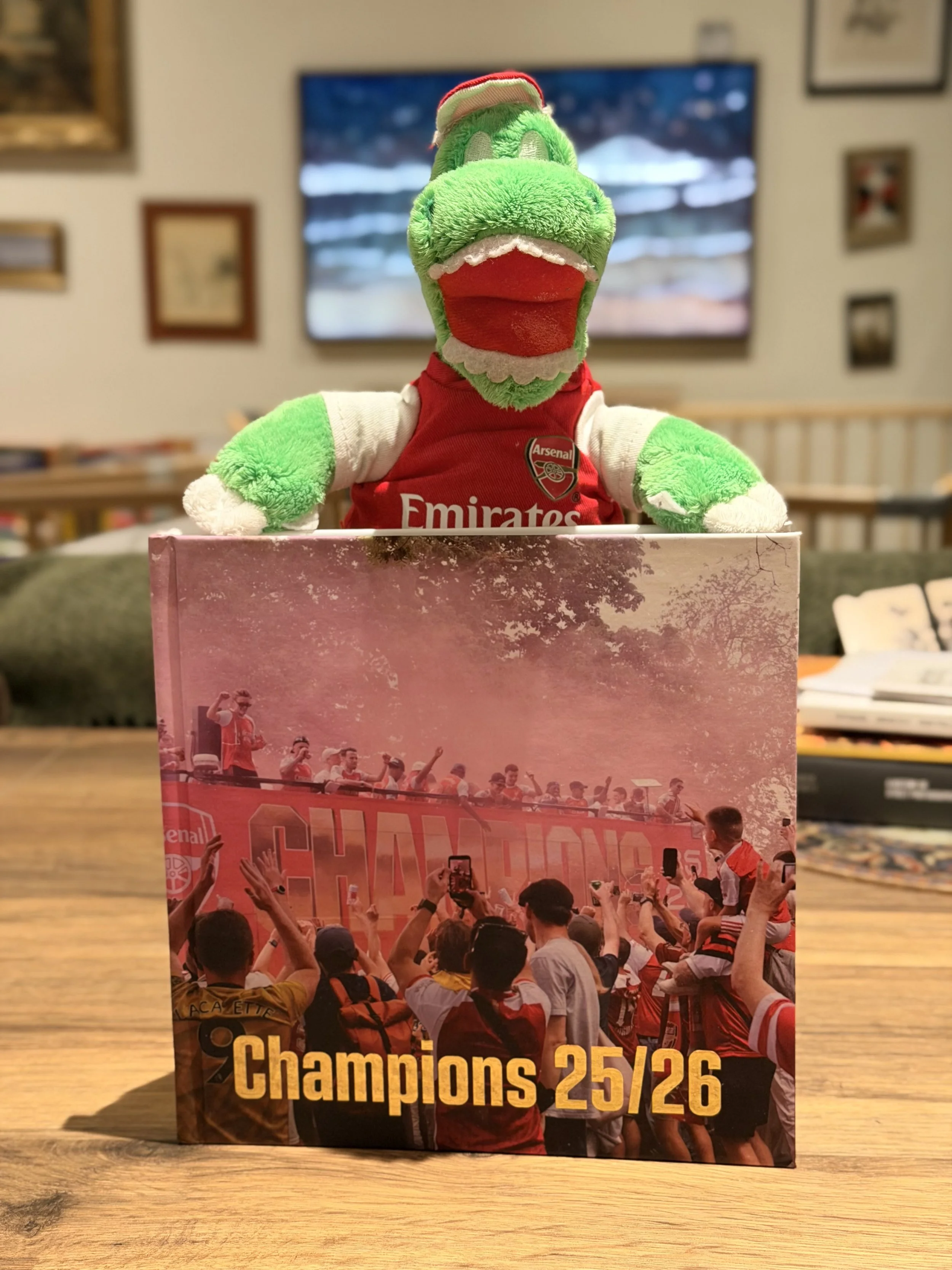
The hardback book, edition of 2. Even forgot to put my name on it anywhere
With that broad arc, I then went to organising the photos, making sure not to have too many in any particular section and keeping things balanced. I wrote about the app ‘Freeform’ before, and it was perfect for this. I was moving images in and out, back and forth, considering pairings and transitions through the zine.
Things were constantly changing, but I did come across three anchor points to move everything else around:
The start and end images, representing a young person dreaming at the beginning and then an older person (22 years older?) worn out at the end.
A contrasting pairing as a way to transition from the daytime photos to the night photos.
A blank page to work almost as a “drop”, giving pause between the quieter section and the louder one, with a single flare acting as the beat of the drum.
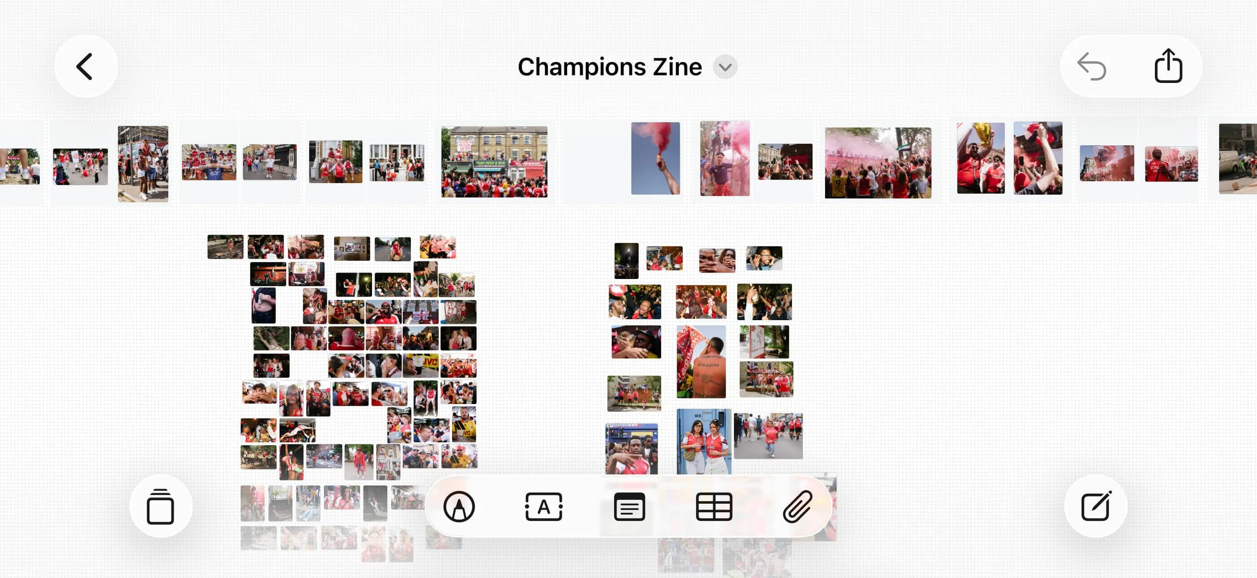
Zine work in progress: Freeform (works better on iPad vs. iPhone)
Then I started to bounce some ideas around with other photographers. While most of the London street community tends to be Arsenal fans (it is London after all), not everyone is, and it was important for me to also get a more distanced opinion.
I highly recommend doing this for any publishing project, as you will naturally be more attached to some photos for reasons that don’t necessarily transmit to the viewer. Their input certainly helped clear up some questions I had, confirming some ideas and suggesting some new ones that made it into the zine. Invaluable.
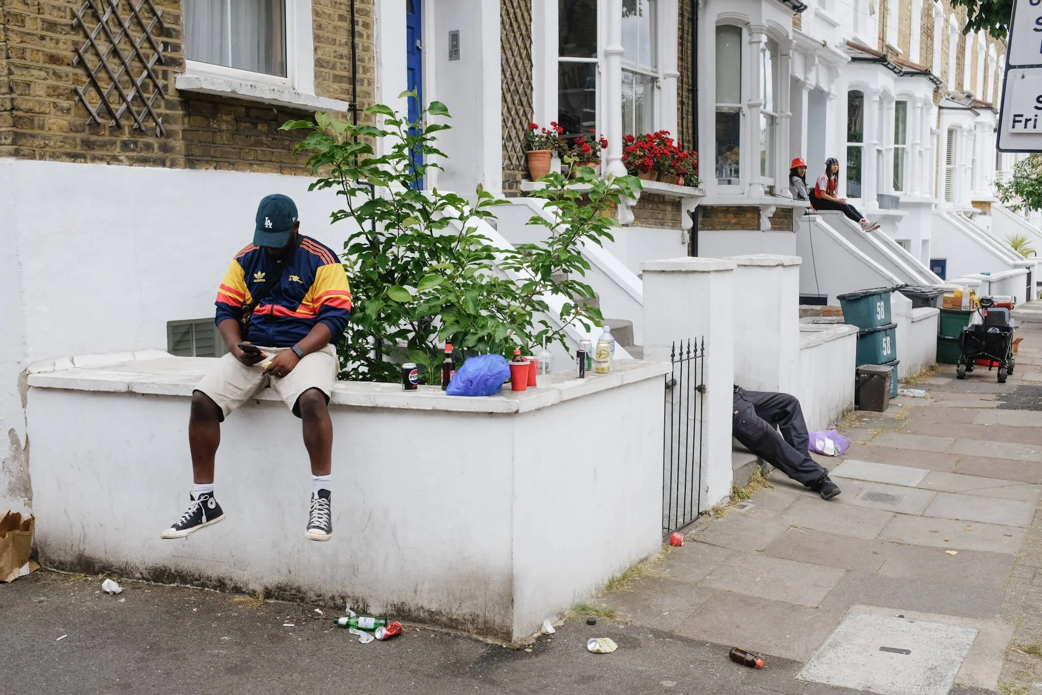
Another image I cut. I had earmarked it for the end of the zine but it didn’t fit in well with the day into night arc
So now I had the body of the zine: 31 images, all sequenced. The next step was to use a publishing app (Affinity) to put it together and also to work on a cover and afterword. I prefer text at the end so you don’t influence the reader until after they’ve seen the images.
More on this in part 3: Publishing and Printing. Stay tuned.